Role
UX Researcher & Designer
Timeline
3 weeks
Tools
Figma
Product Vision
Clover is an online ordering system that consumers can use to place orders for their favorite restaurants or cafes. I specifically worked with a boba tea shop out of Novi, MI that uses Clover for online orders. The goal here was to update the app to make online ordering easier for regular customers, provide them with more detailed information on the various menu items, and also make it easy for the shop owners to update menu items, prices, remove sold out items, update store hours, offer refunds on the backend when necessary, etc.
Challenges
Add visuals and product descriptions to help customers with the ordering process
Include a feature to be able to checkout as a guest and not have to login to order
Incorporate quantity counter for
Make menu and price adjustments easy to fix for business owners
Meet the Users
Lori Denang
Age: 42
Hometown: Buffalo, NY
Occupation: Business Owner
Lori grew up in Buffalo and opened up a bubble tea shop in Michigan where her siblings live. Though her siblings run the day-to-day tasks, she is in charge of managing finances and online ordering. She needs to be able to login to her account and update prices and fix any bugs easily because she also has other businesses she runs and has a family to take care of.
The Problem
Lori, a multiple-business owner and mother of 2, is looking to automate as many administrative tasks as possible so that she can spend more time at home with her family. She needs to be able to easily and efficiently update her store menu and prices through her account instead of adjusting each item individually. Right, the backend of the Clover app is too confusing for her to navigate.
Cynthia Hicks
Age: 36
Hometown: Farmington Hills, MI
Occupation: Car Sales
Cynthia works in car sales at a dealer down the road from her favorite bubble tea shop. She only has a 30-minute lunch break so she needs to be able to order online and trust that her order will be ready for her when it says it’ll be ready, know that she can get her loyalty points every time she orders/logs in, and she wants recommendations based on things she likes.
The Problem
Cynthia works full time in car sales, and she has a very short lunch break. She likes to order boba 2-3 times per week, but she doesn’t have enough time to wait in line so she needs to be able to order online and know that her drink will be ready for her when she gets there. Right now, Clover doesn’t offer any kind of notification system to let her know when her order is ready.
User Research Findings
Users wanted more detailed drink descriptions including ingredients list
Users encountered issues selecting a pick-up time and communicating with the shop about changing pick-up time or order
Shop owners found it difficult to figure out how to take something off the menu and adjust shop hours and prices on the backend
User Pain Points
Customers would like tailored recommendations or a “last ordered” section because the menu is too vast.
Shop owners currently need to update prices for menu items individually which takes up a lot of time.
Customers complain that sometimes their drinks are not made on time from when the app says it’ll be ready.
The Transformation
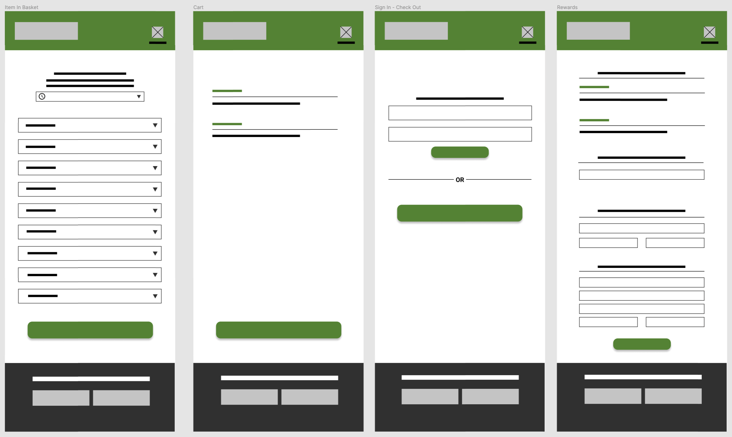
Taking the time to draft iterations of each screen on paper ensured that we could map out the user flow in a cohesive, comprehensive way.
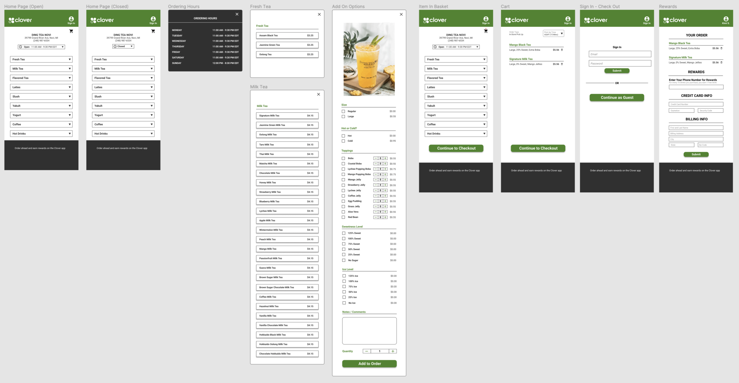
In creating the lo-fi prototype, I connected the primary user flow of viewing the menu, completing an order, and entering a phone number for the shop’s reward system so the prototype could be used in a usability study with users.
The high-fidelity prototype presented cleaner user flows and on-brand colors for a cohesive look. It also met user needs for product visuals and details, easy checkout, and newly-implemented notifications.
View the Clover App Hi-Fi Prototype.
Accessibility Considerations
Add icons, visual details, and product descriptions to increase customer understanding
Create option to checkout without having to create an account
Include option for shop owners to make changes to multiple items in one step
Takeaways & Next Steps
Clover App not only makes it easier for busy consumers to order on-the-go, but it also gives shop owners more flexibility to solve issues from a computer without having to be at the shop all the time. The app helps customers navigate through the checkout process easily and makes the menu easier to read and understand. In reworking some of the app components, I learned more about the needs of both customers and shop owners and how to better integrate them.
Conduct further research to add more backend tools for shop owners to make adjustments.
Continue updating navigation process to make it more seamless and understandable
Build out recommendations section based on previous orders


