Role
UX Researcher & Designer
Timeline
3 weeks
Tools
Figma
Product Vision
Healthy at Home is a recipe-based app that makes it easier for busy people to make quick, healthy recipes at home. Nutrition information, shopping lists, and necessary equipment for all recipes are all accessible from the smartphone in their pocket. The app makes it easier for them to select recipes based on personal tastes and curates recommendations for each week so it takes the work out of coming up with meal prep ideas every day. Our vision is to create an app that provides easy, quick, and healthy recipes that busy folks can make at home. The goal is for the app and cooking experience to be seamlessly integrated into people’s existing routines.
Challenges
Busy parents and working professionals either don’t have the time and energy to cook
Creating a step-by-step guide for cooking because many users never learned how to cook or don’t carve out time to cook every week.
There is a lot of competition when it comes to healthy cooking and eating so how do we differentiate ourselves in an already saturated market.
Meet the Users
Ryan Boseman
Age: 35
Education: Masters Degree in Engineering
Hometown: Detroit, MI
Occupation: Production Engineer
Ryan is a busy working professional who subsists on frozen dinners and bar crawls with friends. He’d rather do that than spend his time cooking at home. Being the fitness fiend that he is though, he feels his poor diet is holding him back from his fitness goals. He wants recipes that are easily accessible and easy to make so he can feel accomplished in a task and feed his body something good.
The Problem
As a busy professional, Ryan can’t find the time to search for recipes and meal prep. He’s overwhelmed and doesn’t know where to start. He doesn’t like wasting food, if he makes a meal but ends up not liking it, and sometimes he can’t find the ingredients he needs in the store so he feels discouraged. He wants to be able to cook 3 nights out of the week and meal prep easy lunches he can take to work throughout the week.
Rosanna Greco
Age: 22
Education: Bachelor’s Degree in Psychology
Hometown: Romulus, MI
Occupation: Office Assistant
Rosanna is a recent college grad working in her first real job. Her parents never taught her how to cook growing up, and she subsisted on ramen and carbs throughout college. Now that she has a little more time, she wants to learn how to cook at home and prepare easy, healthy meals for her and her boyfriend. She doesn’t make a lot of money so eating out frequently is not an option. She needs an easy solution she can reference right in her pocket.
The Problem
Rosanna finds it daunting to search the web for recipes, and she is looking for an app that will guide her through easier meal prep solutions. The main issues she is having is that she can’t seem to find a lot of recipes that use either fewer ingredients or common ingredients so she can eliminate food waste. Lastly, she doesn’t want cooking to take up a lot of time because she has other hobbies.
User Research Summary
I used Healthy at Home’s data to develop interview questions which were then used to conduct interviews. Most interview participants reported that at the end of their work days, they were simply too tired and unmotivated to cook for themselves and instead chose to eat frozen meals or get takeout. The feedback we received during research revealed that most users would like to start eating healthier and eating out less but didn’t know how to carve out the time to do so. They were very open to an app that would help them do so and get into the habit of cooking healthy at home.
User Pain Points
Recipe layouts were not easy to follow and lacking in basic detail
Difficult to figure out how to save recipes or search for specific ones
Unable to differentiate from other healthy eating apps
The User’s Journey
Ryan’s user journey revealed how helpful it would be to be able to save/favorite meals to make and revisit again, to start off with simple meals and be given a suggested path to more complex meals, be given ingredients with alternatives, and using incentives at stores near his home or office.
Usability Study Findings
People want easy-to-follow recipes that won’t break the bank and are healthy
People had difficulty finding recipes that would use most/all leftover ingredients
People found little incentive to keep using the app, not differentiated enough
The Transformation
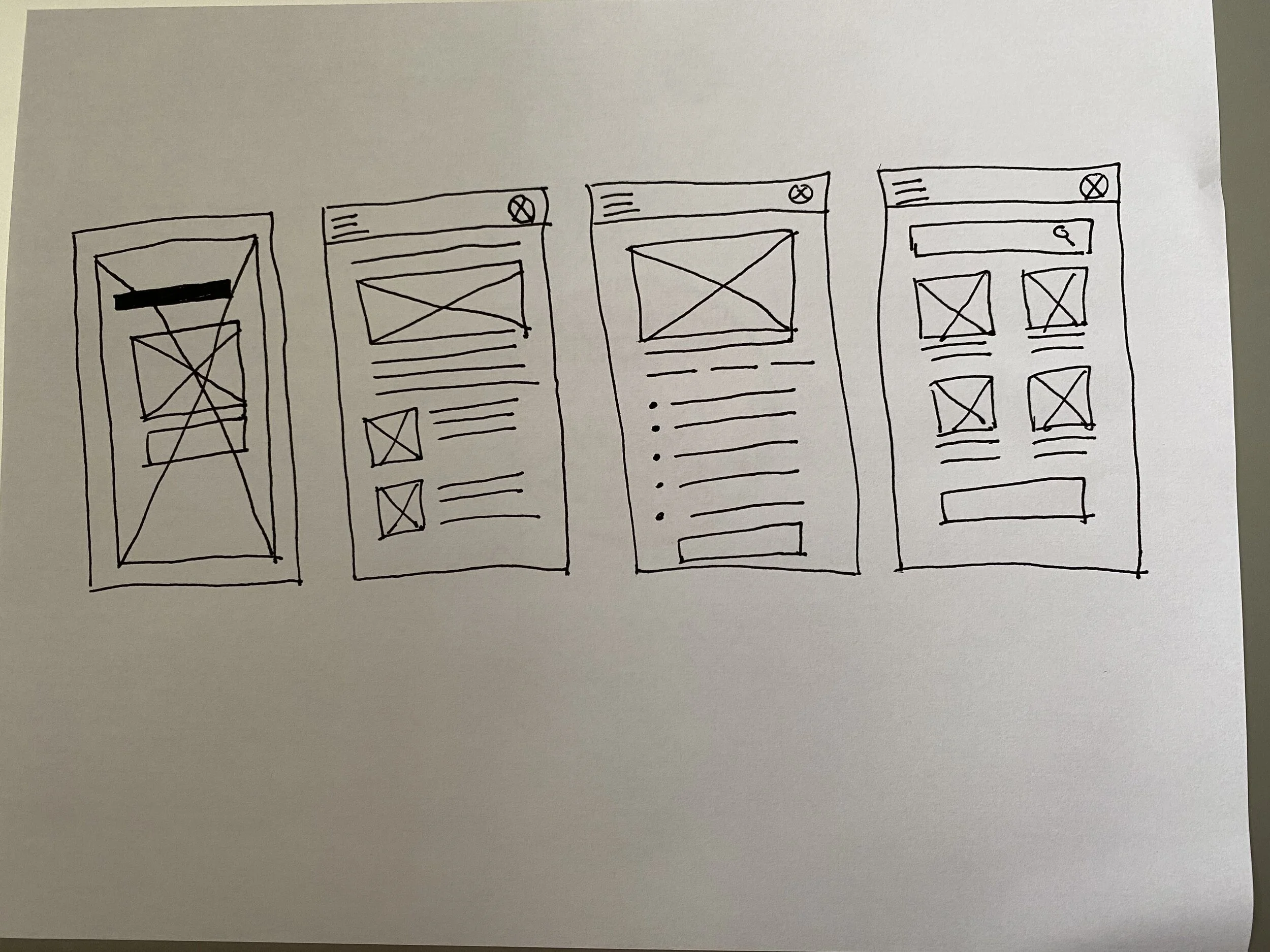
Taking the time to draft iterations of each screen on paper ensured that we could map out the user flow in a cohesive, comprehensive way. For the home screen, I prioritized having an easy login system and the week’s suggested meal plans at the ready for the user to easily access.
In creating the lo-fi prototype, I connected the primary user flow of logging in to instantly view the week’s meal plans, suggested recipes based on previous favorites, and a search function. Prototype also includes a sample of a recipe page with more details to follow in the hi-fi prototype.
View the Healthy at Home Lo-Fi Prototype
The high-fidelity prototype incorporated simpler user flows and on-brand colors for a cohesive look. It also met user needs for more prominent buttons to save recipes and search functions.
View the Healthy at Home Hi-Fi Prototype
Accessibility Considerations
Initial focus of the home screen on their meal to make for the day and personalized recommendations help define the primary task and reduce amount of research the user has to do within the app
Icons and interactive elements included
Both Imperial and Metric measurement systems are incorporated
Takeaways & Next Steps
Users shared that they were cooking at home 2-3 days more than they used to and seeing a 65% savings. It has also helped them discover new recipes and broaden their palette. Some said the app even helped them make cooking a priority in their day-to-day lives. Addressing the issue of differentiating the app from competitors is very vague and a daunting challenge, but breaking down each problem and page and tackling issues as they come up will be most effective.
Conduct research on how successful the app is in user retention and frequency of use.
Add more interactive elements such as video tutorials and forum for discussion.
Incorporate incentives like discounts or gift cards to local grocery stores, kitchenware shops, etc.


