Role
UX Researcher & Visual Designer
Timeline
4 weeks
Tools
Figma
Product Vision
Odori is a new, modern dance studio emerging on the scene in Tokyo, the first studio of its kind in the city to cater to both professional dancers and anyone looking to include dance into their fitness routine through more casual studio classes. Our goal was to collaborate to create an app to help distinguish itself among competitors in the market, make it more accessible to its wide range of users, and create efficient reservation processes to release some burden off of busy city-goers from having to register and reserve classes in-person.
Challenges
Create a more efficient way to book dance classes online instead of signing up in-person.
Design a more cohesive, well-defined brand and navigation system
Provide navigation in both Japanese and English to cater to native Japanese and Tokyo’s growing expat community
Include class descriptions and teacher profiles to help users be as informed as possible
Meet the Users
Yuki Sato
Age: 22
Education: Bachelor’s in Business
Hometown: Tokyo, Japan
Occupation: Office Secretary
Yuki is a Tokyo native who was a competitive dancer for 15 years through her youth. Though she is no longer pursuing dance seriously, she is looking for challenging classes to help maintain her flexibility and dancer physique. She is looking for a dance studio that has multiple locations, preferably close to home so she can go on weekends, offers classes of different skill levels, and where she can book on-the-fly. She is also eager to try new styles of dance.
The Problem
Yuki, a new graduate busy at her first job, needs to find a dance studio close to home or work and be able to reserve classes online while she’s on the go in order to maintain her flexibility and dancer’s physique as well as reduce any long, out-of-the-way commute times.
Tamika James
Age: 35
Education: Masters in Sports & Rehab
Hometown: Atlanta, GA
Occupation: Physical Therapist
Tamika is a new expat in Tokyo. She relocated to the city with her family for her husband’s job and is on the hunt for a dance studio where she can take some classes. Dance is her preferred method of fitness because she finds it fun and challenging, and as a physical therapist, she often works with clients who are dancers. Her work schedule, skill level, and limited language ability have made it difficult to find a studio to match what she’s looking for.
The Problem
Tamika, a busy working mom of 2, needs to find a dance studio that offers classes that fit her schedule, match her skill level, and provides some English instruction so that she can stay fit, develop a healthy work-life balance, and carve out some “me time” in her week.
Primary Research Findings
Users requested a feature to easily locate studios close to their homes or offices
Users would like to see teacher profiles with their dance experience and language proficiency
Users found it easy to update profile information but to difficult to locate recent class history
User Pain Points
Working adults are too busy to stop in-person to sign up for classes or membership at studio
App offers translations in both Japanese and English, but there isn’t a way to toggle between the two while browsing
Information provided on the app doesn’t detail all the studio has to offer
The Layout
The Transformation
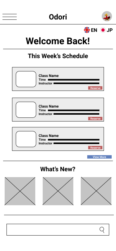
For the initial drafts of the lo-fi prototype, I focused on keeping upcoming classes front and center and connecting the primary user flow of viewing and reserving a dance class so the prototype could be used in a usability study with users. It also provided a framework for laying out all of the pertinent information in a simple fashion.
Further development for the high-fidelity prototype presented cleaner user flows, on-brand colors for a cohesive look, and incorporating secondary priorities like adding description pages for each dance class and adding a page for teacher profiles. It also met user needs for language selection and storing payment options.
Welcome Screen
The first screen Yuki and Tamika see allows them to select the language they want to navigate in. The app will remember their selection so after they choose one, they won’t see this screen again each time they open the app. Here, the selected language is English, but if they had selected Japanese, the “Continue” button would’ve automatically updated to Japanese. If at any point they want to change their selection, they will be able to change it under settings on their profile page.
Furthermore, on the login screen, there is an option to have the app remember their login information, eliminating the inconvenience of having to log in every time.
Home Page
The main page the users see after logging in hosts three critical sections: the upcoming week’s schedule, major announcements from the studio, and recommended classes based on their reservation history.
Class Information
In their search, users can read more details about each class before they make a reservation. Each class page features a description of the style of dance, what to expect, what to bring, and intensity rating.
Studio Locator
Users are able to locate the closest studio by entering their home or office address. Alternatively, they can simply enter the closest ward name and the closest locations will pop up in order of closest to furthest distance.
Member Code
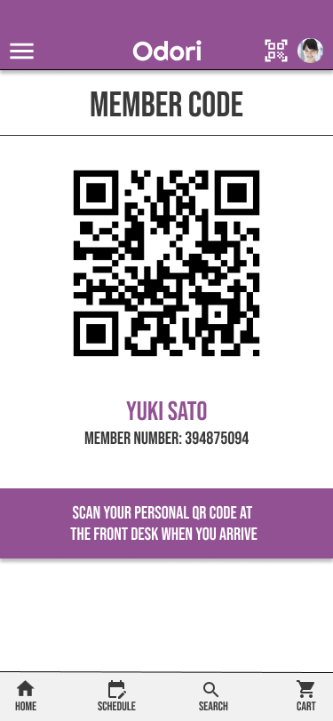
Rather than carrying around a physical card, members can log in to the app, click the QR code icon on the top right corner, and it will open the page below so they can scan it at the studio.
Reservation Process
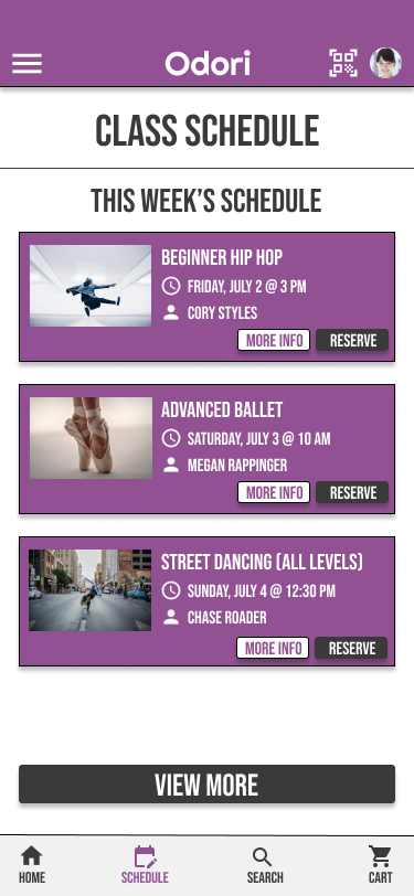
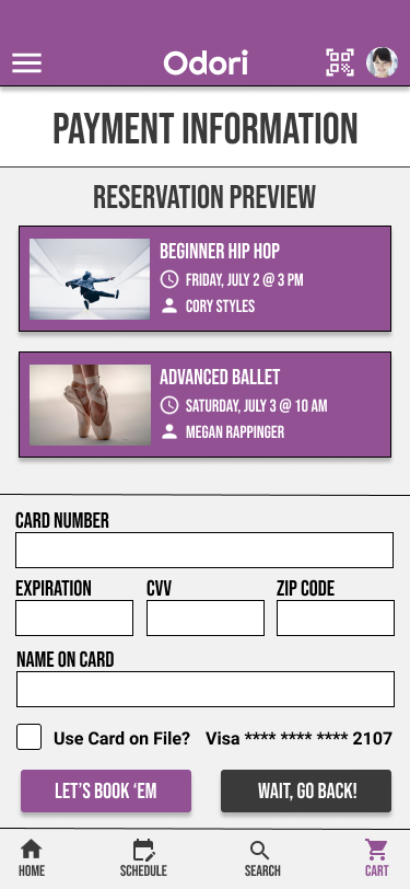
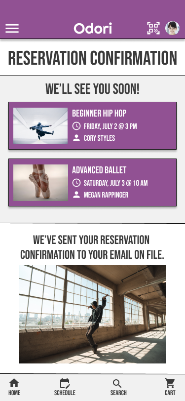
The reservation process begins with the ability to look at the upcoming week’s class schedule. From the list, you can opt to look at each class description or reserve if the user has previously taken that class. The class gets added to your cart, and from there you can either keep browsing or continue to check out. Users also have the option of removing a class from their cart, and in doing so, the total price to be paid will automatically be updated. On the payment page, users can enter card information or they can choose to use a card they already have on file. Users have the ability to update their payment information via the profile page. They can add or remove payment methods and select their default payment method. Once the user has paid, they’ll be redirected to a confirmation page. A confirmation will also be sent to their email address on file, and their reservations will be stored on the app too.
Accessibility Considerations
Provides language selection at the start of the navigation process and buttons on each page to change anytime
Uses icons to help make navigation easier.
Detailed description pages for each dance class and instructor. Difference in nuance of different languages are taken into consideration.
Takeaways & Next Steps
The app not only makes it easier to access for Odori’s wider audience, but it helps them make informed decisions quickly and efficiently. It caters to both types of audience they’re looking to attract to their studio and build a loyal customer base out of. In building and using the app, I learned more about the needs and difference in information sought after between Japanese speakers and expats.
Finalize professional Japanese translations to make sure it caters properly to native speakers
Conduct further studies to make sure navigation process is more seamless, specifically that it’s easy to cancel or change reservations online.
Continue building “recommended classes” and “recent class history” sections on the app.


