Role
UX Researcher & Visual Designer
Timeline
1 Year
Tools
Figma
Product Vision
Help in Hand is a online service that connects people and the problems they're trying to solve with a qualified expert to help find a solution. They specifically serve the travel, health, and home maintenance industries. Users are able to connect with certified experts via phone or video calls and explore a wide range of blog posts and FAQs to help answer their questions.
Initial Goals
Build foundational functionality such as onboarding process, expert profiles, search function, account page and payment feature.
Develop payment system.
Design robust communication system between users and experts.
Meet the Users
Gina P.
Age: 34
Job: Freelance PR Manager
Status: Single, has 2 dogs
Location: Denver, CO
Gina is a freelance PR manager. She is based in Colorado, and lives solo in an apartment. She does move around a lot and likes to travel. She likes to learn new things, is fairly tech-savvy, and sets her own work schedule so she can maintain a healthy work-life balance and get as much playtime as possible with her 2 dogs.
She has good people skills and asks a lot of questions. Additionally, because her monthly income fluctuates, she is very careful about how she spends her money.
Goals & Needs
Consult with different travel experts on the fly
Be self-sufficient and adaptable and build rapport with experts
Gather knowledge she can use in the future
Gina’s Journey
Stanley Y.
Age: 46
Job: Financial Analyst
Status: Wife, 3 kids, 1 cat
Location: Hartford, CT
Stanley has a full life. He works as a Financial Analyst which often requires overtime hours at the office and means that he's attached at the hip with his smartphone and doesn't have much time to pursue hobbies or other interests. He has the flexibility to work at home 2 days/week and doesn't need to travel for work.
On top of that, he has a family and a pet to provide for. Due to his busy schedule, he often has to outsource help for home maintenance chores, babysitting, etc.
Goals & Needs
Access online help available anywhere he goes
Seek quick guidance from experts
Store account info, preferences, and history so he can pick up where he left every time he launches the app
Stanley’s Journey
User Flow:
Complete a consultation with an expert
User Flow:
Search for and select an expert
User Flow:
Store payment info on billing page
User Flow:
Leave a review for an expert
The First Stages of Prototyping
In our initial prototypes, we kept the layout very simple since we were just laying the foundation and brainstorming different ways to format the app for the most user-friendly experience.
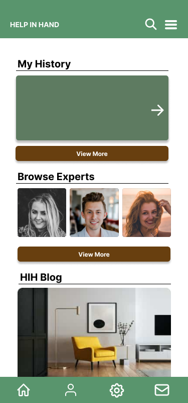
From the dashboard, users would be able to navigate to their history on the app, be able to browse for experts, and access the blog for quick tutorials.
When users search for an expert, they'd be able to select someone who's a good match, works in the industry for the problem they want to solve, and read more info.
Once a user clicks on an expert’s photo, they’ll be directed to the bio page that lists an expert’s background info, experience, and qualifications and certifications.
Testing with Our Users
In our first round of usability testing, we sat down with six users for a remote study. Each interview lasted 45-60 minutes, and we had users review overall design and functionality. The four main points we tested included:
Observe users through the onboarding process and whether or not they walk through the tutorials.
Measure how quickly users are able to search for and connect with an expert.
Decipher what methods users use to connect with expert and note any pain points they have in chatting with experts
Understand better what criteria users use to select an expert based on the problems they're looking to solve.
Original Site Map
Primary Research Results
Users were easily able to navigate back and forth within the app.
Users expressed how simple the design was which made it very approachable.
Had a good mix of imagery, iconography, and text which helps break up monotony.
User Pain Points
Expert profiles could use more detail and differentiation of icons/badges.
Frustrated that there wasn’t onboarding process in initial prototype.
Needs more robust search feature to be able to filter experts who are the best match.
Learnings
Even though it was explained in the introduction of the sessions, users were very detailed in their observations about how the app might look down the line in more detailed iterations. Overall, users were easily able to navigate back and forth within the app and expressed that the basic functionality and navigation were there.
There were some valid critiques about inconsistencies with branding colors, icons, and button issues. Also learned that it would bring the app more to life if we used real photos instead of stock photos to personalize the design a bit more.
Expert profiles could use more detail and more icons/badges to make it easier for users to identify which industries they work in, depth of background check, and certifications.
Overall, it was a mixed bag of feedback, but we got a lot of good insight to move forward with.
Updated Site Map
Prototype Updates
After our first round of testing, we updated brand colors, started to fill in pages with more detailed information and iconography, and built out scheduling feature.
From the home page, users will be able to photos of an expert. Home page in general was updated with more dynamic visuals.
User can read through the expert's bio and qualifications in more detail and click the phone icon at the bottom to book a call.
A calendar will pop up, and users will be able to select a date from an expert's open availability.
Final Stages of Prototyping
In building high fidelity prototypes, we primarily focused on upgrading the visuals, incorporating accessibility features, and balancing each page with imagery and text.
Login screen built to include logo at the bottom for branding purposes, new mauve colored button, easy options to create an account or reset password, and ability to show or hide password when entering.
Expert’s profile page now comes complete with iconography to indicate what field they work in, whether or not they’ve been verified, and how many likes and reviews they have. Each section of their bio is also expandable to reduce text clutter.
Home Screen now customized with personal greeting and important notices or updates at the top of the screen. Again, new mauve colored buttons were incorporated, and highlighted icon in bottom navigation to indicate which page a user is on.
When users click on the “Book Call” button, a calendar pops up on the same page instead of a separate page. When users click anywhere on the screen off the calendar, it will go away. Colors of the calendar have also been adjusted to match brand colors.
Browsing experts page now includes a robust search feature with ability to use filtering system, and each expert’s photo now includes their name underneath as well as icon indicating what field they work in.
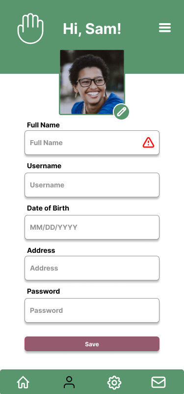
The account info page also includes custom greeting and includes user’s profile photo which they can easily edit by clicking on pencil icon. Info will not be saved unless all info is filled in. Missing info is indicated with red triangle icon.
Looking Forward
Our work is not done here. Even after launch, we will continue running surveys and conducting usability tests. This will be especially important as we add new features, pages, and information. Our primary focus is to make sure that users can find the info they’re looking for in the fewest clicks possible and connect with experts with as little of a headache. We want to continue recruiting qualified experts and fill a need in the market where we help users solve a problem and not add another task to their plate.


